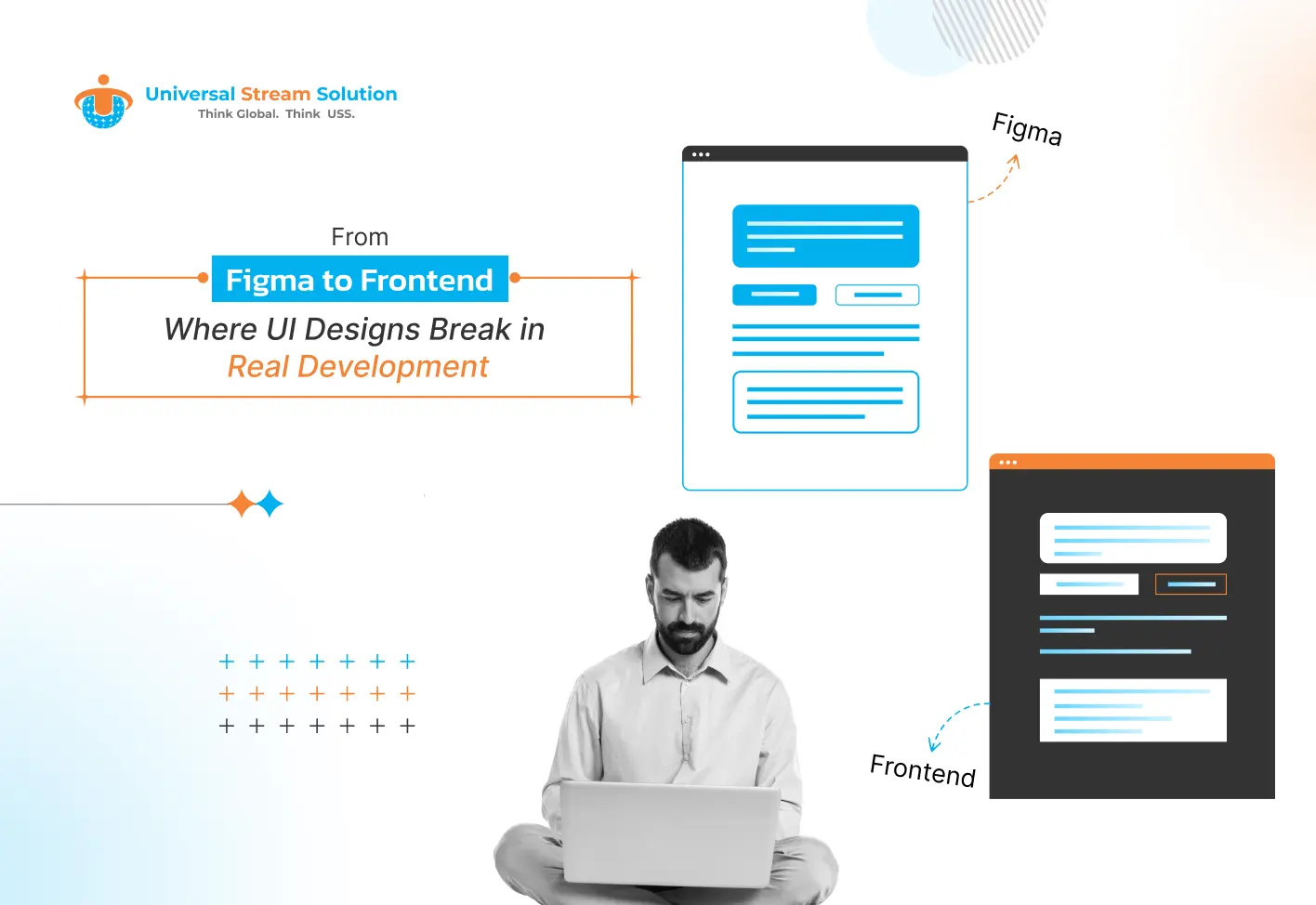
From Figma to Frontend: Where UI Designs Break in Real Development
 25th May, 2026
 6 min read
Table Of Contents
- Introduction
- Why Figma Designs Often Fail in Real Development
- Static Designs vs Real Responsive Layouts
- Beautiful Animations Can Hurt Performance
- Real Content Rarely Matches Design Mockups
- Missing Design System Components
- Browser Compatibility Creates Unexpected Problems
- Fonts and Typography Rarely Match Exactly
- Accessibility Is Commonly Ignored During Design
- Mobile-First Development Is Still Ignored
- Frontend Performance Directly Affects SEO
- Poor Communication Breaks Projects
- How Modern Development Teams Solve These Problems
- Design Systems
- Component-Based Frontend Development
- Continuous UI Testing
- Developer Involvement During Design
- Best Practices for Businesses
- Final Thoughts
Introduction
In modern software development, creating an attractive user interface is only the beginning of building a successful digital product. Many businesses assume that once a UI design is completed in Figma, the development process becomes straightforward. However, experienced frontend developers know that the real challenge starts when those designs move from static screens into real-world applications.
The gap between UI/UX design and frontend development is one of the most common reasons projects face delays, inconsistencies, redesigns, and performance issues. A design may appear visually perfect during presentations, but real users interact with websites and applications under unpredictable conditions:
- Different devices
- Slow internet connections
- Dynamic content
- Browser limitations
- Accessibility needs
- Performance constraints
This is why many UI designs “break” during actual frontend implementation.
Understanding where these issues happen helps businesses build better products, improve collaboration between teams, and create smoother user experiences.
1. Why Figma Designs Often Fail in Real Development
Design tools are built for creativity and visualization. Frontend development is built for functionality, scalability, and performance.
A designer focuses on:
- Layout aesthetics
- Visual hierarchy
- Branding
- Interactions
- User flow
A frontend developer must think about:
- Responsive coding
- Accessibility
- Performance optimization
- API integration
- Browser compatibility
- SEO
- Application logic
This difference in priorities creates a natural gap.
While Figma provides excellent visual representation, it does not simulate real development conditions such as:
- Dynamic databases
- User-generated content
- Slow rendering devices
- Mobile hardware limitations
- Cross-browser behavior
As a result, developers often need to modify or rebuild sections of the design during implementation.
2. Static Designs vs Real Responsive Layouts
One of the biggest problems occurs when fixed-size designs meet responsive frontend development.
Designers usually create UI screens for ideal dimensions like:
- Desktop (1440px)
- Tablet (768px)
- Mobile (375px)
But real users access applications from:
- Large ultrawide monitors
- Foldable phones
- Small laptops
- Smart TVs
- Tablets with unusual resolutions
A design that looks balanced inside Figma may:
- Overflow outside containers
- Break grid alignment
- Cause text wrapping issues
- Stretch images incorrectly
- Create inconsistent spacing
Frontend developers must transform static layouts into flexible systems using:
- CSS Flexbox
- CSS Grid
- Responsive containers
- Relative spacing units
- Breakpoints
- Media queries
For example, a homepage hero section with perfectly aligned text and images may completely collapse on smaller screens if responsiveness was not planned early.
This is why responsive thinking should begin during the UI design process itself instead of being treated as a development-only responsibility.
3. Beautiful Animations Can Hurt Performance
Modern UI trends heavily focus on animations and interactive experiences.
Designers frequently create:
- Microinteractions
- Hover effects
- Scroll animations
- Glassmorphism
- 3D effects
- Complex transitions
- Motion-based navigation
While these designs look attractive in prototypes, implementing them in real frontend environments is far more difficult.
Heavy animations can:
- Increase loading times
- Consume CPU resources
- Drain mobile battery
- Cause lag on older devices
- Reduce accessibility
- Lower SEO performance
For example:
A smooth parallax effect may work well on a high-performance computer but become extremely laggy on entry-level Android devices, negatively affecting overall website user experience optimization, mobile usability, and frontend performance.
Frontend developers must optimize animations carefully using:
- Hardware acceleration
- Lightweight libraries
- Efficient rendering techniques
- Lazy loading
- Motion reduction settings
Sometimes developers are forced to simplify original animations to maintain performance and usability.
4. Real Content Rarely Matches Design Mockups
Most UI designs use perfectly curated content:
- Short titles
- Balanced paragraphs
- High-quality images
- Ideal user names
- Clean product descriptions
Real-world applications are unpredictable.
Users may upload:
- Extremely long names
- Large unoptimized images
- Empty profile data
- Unexpected symbols
- Multiple languages
This creates layout problems that static designs never anticipated.
Example:
A card component designed for a 15-character product title may completely break when a real product contains 100 characters.
Frontend developers must create scalable UI systems capable of handling:
- Variable text lengths
- Multilingual content
- Dynamic database responses
- User-generated media
- Empty states
- Error states
Without proper content flexibility, designs become fragile.
5. Missing Design System Components
Many businesses invest in visually appealing screens but forget to build a complete design system.
A proper design system should include:
- Typography rules
- Color systems
- Buttons
- Form fields
- Hover states
- Error states
- Disabled states
- Loading states
- Empty states
- Mobile behavior
- Accessibility guidelines
When these elements are missing, developers must make assumptions.
This creates:
- Inconsistent UI behavior
- Longer development cycles
- Repeated redesign requests
- Poor scalability
For example:
If a designer only creates the default version of a button but ignores hover and disabled states, developers may implement styles differently across pages.
Large-scale frontend projects require reusable and standardized UI components.
6. Browser Compatibility Creates Unexpected Problems
One major issue that design tools cannot simulate is browser inconsistency.
Applications must work across:
- Google Chrome
- Safari
- Mozilla Firefox
- Microsoft Edge
Each browser handles rendering slightly differently.
This affects:
- Fonts
- Flexbox behavior
- CSS positioning
- Animations
- Spacing
- Form styling
A design that appears perfect in one browser may break in another.
Frontend developers spend significant time fixing:
- Cross-browser bugs
- Rendering inconsistencies
- Responsive alignment issues
This hidden complexity is often underestimated during project planning.
7. Fonts and Typography Rarely Match Exactly
Typography is another major challenge when converting Figma designs into real frontend interfaces, which is why businesses increasingly rely on advanced tools for modern product design to maintain consistency between UI concepts and frontend implementation.
Even if developers use the exact:
- Font family
- Font size
- Line height
- Letter spacing
the result may still appear visually different.
Why?
Because fonts render differently depending on:
- Operating systems
- Browsers
- Screen resolution
- Font smoothing
- Device hardware
For example:
Typography on macOS may appear cleaner than on Windows systems.
This creates frustration when businesses expect “pixel-perfect” matching between Figma and production environments.
Frontend teams must often adjust:
- Spacing
- Typography scaling
- Layout structure
- Font fallbacks
to maintain visual consistency.
8. Accessibility Is Commonly Ignored During Design
Accessibility is one of the most overlooked aspects of UI design.
Many interfaces prioritize aesthetics over usability.
Common accessibility problems include:
- Low contrast text
- Tiny clickable areas
- Poor keyboard navigation
- Missing labels
- Overly complex animations
- Unreadable font sizes
Frontend developers must ensure interfaces work for:
- Screen readers
- Keyboard users
- Visually impaired users
- Motion-sensitive users
Modern applications should follow accessibility standards like:
- WCAG guidelines
- Semantic HTML
- ARIA labeling
- Color contrast standards
Sometimes developers need to redesign sections completely to achieve accessibility compliance.
Accessible design improves:
- User experience
- SEO
- Inclusivity
- Legal compliance
9. Mobile-First Development Is Still Ignored
Despite mobile traffic dominating the internet, many businesses still design desktop-first interfaces.
This creates serious frontend problems later.
Desktop-focused designs often:
- Become cluttered on mobile
- Use oversized images
- Create difficult navigation
- Slow down loading speed
- Reduce usability
Frontend developers then spend extra time rebuilding:
- Navigation menus
- Card layouts
- Touch interactions
- Responsive grids
- Mobile performance
A mobile-first design strategy helps teams:
- Prioritize usability
- Improve performance
- Reduce redesign work
- Create scalable layouts
Today, mobile optimization is no longer optional.
10. Frontend Performance Directly Affects SEO
Modern frontend development is deeply connected with SEO performance.
Search engines prioritize:
- Fast loading speed
- Stable layouts
- Mobile usability
- Responsive performance
Google’s Core Web Vitals measure:
- Largest Contentful Paint (LCP)
- Interaction responsiveness
- Layout stability
Heavy UI designs with:
- Large videos
- Complex animations
- Unoptimized assets
- Excessive JavaScript
can negatively impact rankings.
Frontend developers must optimize:
- Image formats
- Lazy loading
- Code splitting
- Rendering performance
- Asset compression
This is why visually impressive interfaces sometimes require technical simplification.
A fast website often performs better than an overly decorative one.
11. Poor Communication Breaks Projects
One of the biggest reasons UI designs fail during development is lack of collaboration.
Many projects separate:
- Designers
- Developers
- Product managers
- Marketing teams
When communication is weak:
- Developers misunderstand design intentions
- Designers ignore technical limitations
- Stakeholders introduce late changes
- Inconsistencies increase
The most successful software companies encourage continuous collaboration throughout the project lifecycle.
Regular communication helps teams:
- Identify technical issues early
- Improve implementation accuracy
- Reduce revisions
- Deliver faster results
Frontend success depends as much on teamwork as technical skills.
12. How Modern Development Teams Solve These Problems
Leading software development companies use modern workflows to reduce design-to-development issues.
13. Design Systems
Reusable UI systems improve:
- Consistency
- Scalability
- Development speed
- Collaboration
Popular systems include:
- Material Design
- Ant Design
- Custom component libraries
14. Component-Based Frontend Development
Modern frameworks like:
- React
- Angular
- Vue.js
allow teams to create reusable frontend components.
This improves:
- Maintainability
- UI consistency
- Scalability
- Performance optimization
15. Continuous UI Testing
Professional frontend teams regularly test:
- Responsiveness
- Accessibility
- Browser compatibility
- Mobile behavior
- Animation performance
Testing helps detect UI breaks before launch.
16. Developer Involvement During Design
The best products are created when developers participate during:
- Wireframing
- UX planning
- Responsive discussions
- Component creation
This reduces unrealistic design expectations.
17. Best Practices for Businesses
To reduce frontend implementation issues, businesses should:
Build Responsive-First Designs
Think beyond fixed desktop screens.
Use Realistic Content
Avoid placeholder-only designs.
Create Complete Design Systems
Include all component states and variations.
Prioritize Performance
Avoid excessive animations and heavy assets.
Design for Accessibility
Ensure usability for all users.
Encourage Team Collaboration
Keep designers and developers aligned throughout the project.
Final Thoughts
The journey from Figma to frontend development involves far more than converting designs into code.
Real frontend engineering requires balancing:
- Creativity
- Responsiveness
- Performance
- Accessibility
- Scalability
- SEO optimization
- User experience
Beautiful UI designs alone do not guarantee successful digital products.
The best applications combine:
great design, practical frontend architecture, optimized performance, and seamless usability.
As businesses continue investing in digital transformation, understanding where UI designs break during real development becomes essential for building scalable and high-performing digital experiences supported by modern UI/UX development solutions that improve usability, responsiveness, and frontend performance.
Companies that bridge the gap between design and development create products that are:
- Faster
- Smarter
- User-friendly
- SEO optimized
Sandeep Dodiya
Sandeep Dodiya is a UI Developer Expert specializing in creating intuitive, high-performance user interfaces for web applications. He combines design insight with coding expertise to deliver seamless digital experiences.
Related Blogs